by Audrey Neal
Wondering how to go hybrid? This article offers hands-on digital techniques for the traditional paper scrapbooker.
Editor’s note: Whether you’re a paper scrapper looking for ways to enhance your photos and journaling, or a digital scrapper looking to get down and dirty with paper and glue, hybrid scrapbooking offers limitless possibilities for combining paper with digital scrapbooking skills and supplies. “The Best of Both Worlds” is a four-part series designed to share a range of hybrid techniques for photos, paper, embellishments, titles, and journaling.
The process of combining digital and traditional scrapbooking techniques and supplies has undergone quite an identity crisis over the past few years. When I first noticed the techniques on a popular message board several years ago, scrappers who mixed these two mediums laughingly referred to themselves as “bi-scraptual.” Some labeled it as “computer-aided scrapbooking,” while others called themselves “hybrid” scrapbookers; a term that gained popularity and has become the norm in scrapbooking terminology.
But it wasn’t just the name that gave scrapbookers pause. What exactly defined a hybrid scrapbooker? Was it someone who built their page foundation in a graphics program, printed it out, and then added dimensional embellishments? Or was it someone who printed their journaling or tweaked their photographs before printing and scrapping them with traditional supplies? Did you have to have a high-end graphics program like Photoshop to be a hybrid scrapbooker, or could anyone with access to a word-processing program consider themselves hybrid? The answers to all of these questions are debatable. But if there’s one area of hybrid scrapbooking where most scrappers have experience, it’s with using a word-processing program or other software to create their journaling.
We’ve gathered a number of simple techniques that can be used with any word-processing software programs and easily modified for a variety of results.
Font-tastic
One of the simplest ways to add variety and emphasis to your typed journaling is to mix your typefaces. By using one basic font for the majority of your journaling, and then adding a second typeface to emphasize key words or phrases, you can add real punch to your design in just a few minutes. Before you start mixing fonts willy-nilly, though, there are some basic principles of typography that you should make sure you know.
When it comes to choosing the right font for your layout, your options are pretty much limitless. All of these fonts will fit into one of four categories, though. Serif fonts contain thick or thin swashes at the ends of each letterform. These fonts are traditional and most commonly used for the text we find in books and magazines. Sans serif fonts have a cleaner, more graphic look because they lack the serifs (or swashes) found on serif fonts. These fonts are pretty uniform in width and size. Script fonts create an elegant, timeless feel by duplicating calligraphy or handwriting, but be careful when using them because they can be difficult to read. Finally, display fonts serves as a catchall category for any typeface that doesn’t fit into one of the previous categories. These types of fonts work best for titles, as the amount of detail in the design makes them a poor alternative for journaling.
Some other things to keep in mind:
- Try to keep the number of fonts per page limited to three or less. Any more than that and things just look jumbled.
- Experiment by using one font and varying both the size (12 pt, 18 pt, 24 pt) and weight (regular, bold, italic).
When you select certain phrases to highlight with a different font, make sure you don’t overdo it or the result can be chaotic.
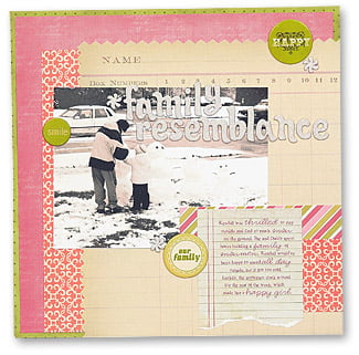
Family Resemblance
by Audrey Neal
To create this look, follow these easy steps:
- Type your journaling as you’d like it to appear, using your main font choice.
- Highlight each word or phrase and then change the font type (and size, if needed).
- Print directly onto your layout, or print onto patterned paper or cardstock and then adhere to your layout

Tag, You’re It!
When you break hybrid scrapbooking down to its most basic form, it’s all about printing out a digital element, cutting it out, and attaching it to your traditional layout. Journaling tags make a great bridge between traditional scrapbooking techniques and digital journaling. Tags range from simple squares, circles, rectangles, and ovals (with or without journaling lines) to more elaborate shapes and fill-in-the-blank varieties. You can purchase them pre-made, or you can create them yourself. There’s a journaling tag or template out there for everyone.
Looking for some fun ways to personalize journaling tags? Try these:
- Print your journaling onto pre-made tags. Measure the tag and then type out your journaling. Print onto a regular sheet of paper and attach the tag on top of the journaling, using removable adhesive. Run the paper (with the tag attached) back through your printer.
- Use the selection tool in a program like Photoshop to remove the background from a digital journaling tag, leaving only the black lines and text. Use the “magic wand” tool and click on the black lines or text. Right click and select “similar.” Right click again and select “Copy to duplicate layer.” Delete the original tag. This will leave you with just the black outline. Now you’re ready to print the tag on any colour paper of your choice, digitally or traditionally.
Holly created a simple journaling spot on her layout by first taking a digital frame created by Rhonna Farrer and printing it directly onto her layout. Next, she journaled inside the frame. Another alternative would’ve been to print the digital frame onto paper and then cut it out and adhere it to the layout; this option is particularly useful if you’re unsure about printing directly onto your layout or you don’t have a wide-format printer.
Quote, Unquote
Sometimes you don’t have to come up with your own journaling on your layouts because you’ve found the perfect quote; why say it yourself when someone else has already said it—and said it better, after all? Depending on how much work you want to do yourself, you can either purchase these quotes ready-made, or use a variety of fonts from your own collection to create your own.
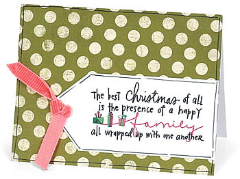
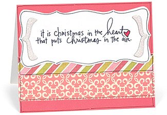
I personalized the digital handwritten quotes on these Christmas cards using the following steps:
- Open the quote in Photoshop.
- Select Layer>Duplicate layer.
- Select a new colour using the eyedropper tool and fill a new layer with that colour (Layer>Fill). Group and merge the colour layer with the quote (Ctrl+G, Ctrl+E).
- Erase any parts of the quote that you want to remain the original colour. Repeat this process until all the key words are in a different colour.

No matter how you define hybrid scrapbooking, there’s no denying that a few simple digital techniques can turn your traditional layouts and cards into something terrific. The best part? Anyone with a word processing program can give these techniques a shot. There’s a whole new world available to you—so give it a try today.

